Metadata
- Source
- VP-84
- Type
- Bug
- Priority
- Blocker
- Status
- Closed
- Resolution
- Fixed
- Assignee
- N/A
- Reporter
- Anastasia Cheetham
- Created
2012-10-22T10:57:33.155-0400 - Updated
2013-01-28T09:25:22.579-0500 - Versions
- N/A
- Fixed Versions
- N/A
- Component
- N/A
Description
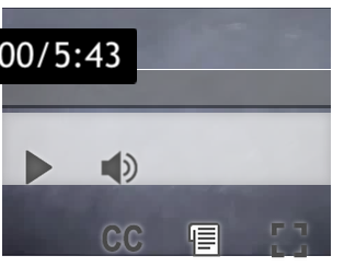
When UIO is used to enlarge the text, the buttons in the VideoPlayer toolbar enlarge. When the video is rather narrow, the enlarged buttons don't fit: they split into two rows, obscuring most of the video.
This is currently viewable with the single-video demo on Safari and Chrome on OSX.
Attachments
Comments
-
Anastasia Cheetham commented
2012-10-22T10:58:18.971-0400 This file (large-controls-small-video.png) shows what the video window looks like in Chrome with the text size maxed out.
-
heidi valles commented
2012-11-05T13:25:07.929-0500 We'll need some design input on this: right now controls and timeline overlap the video, but if they are made larger, this takes up too much of the video's space and it no longer becomes visible. The controls should therefore go below the video but not sure if there would be room for this when integrated (can we allow for that extra space below). Is there a minimum size for video?
-
heidi valles commented
2012-12-05T10:49:47.153-0500 Also, consider over-riding user's line-height adjustments for the buttons and time info. Right now it bumps these things down which affects layout/borders.
-
Jonathan Hung commented
2013-01-21T12:28:40.328-0500 This does not appear to be an issue any more. The video player maintains a fixed size and the controls no longer seem to wrap when the player is resized.